top of page

Vitaliz (Distribuidora de Productos Naturales)
Corporate Identity / Photo Product
Logo - Business Cards - Catalogue - Stickers - Van Decal

Vitaliz (Natural Products Distributor), requested a fresh and renovated image for their company. An identity that takes a stance in the industry with high quality and reliable medicines offered to the most prestigious naturopathic physicians in the area.
Naturopathy or Naturophatic is a form of alternative medicine that uses any array of pseudoscientific practices branded as "natural", "non-invasive", and as promoting "self-healing". The ideology and methods of naturopathy are based on vitalism and folk medicine, rather than evidence-based medicine.

The Business Card was designed with the idea of highlighting its natural concept based on the plants; implementing a picture of Aloe Vera, one of a well-known and most used medicinal plants in the natural pharmaceutical field.
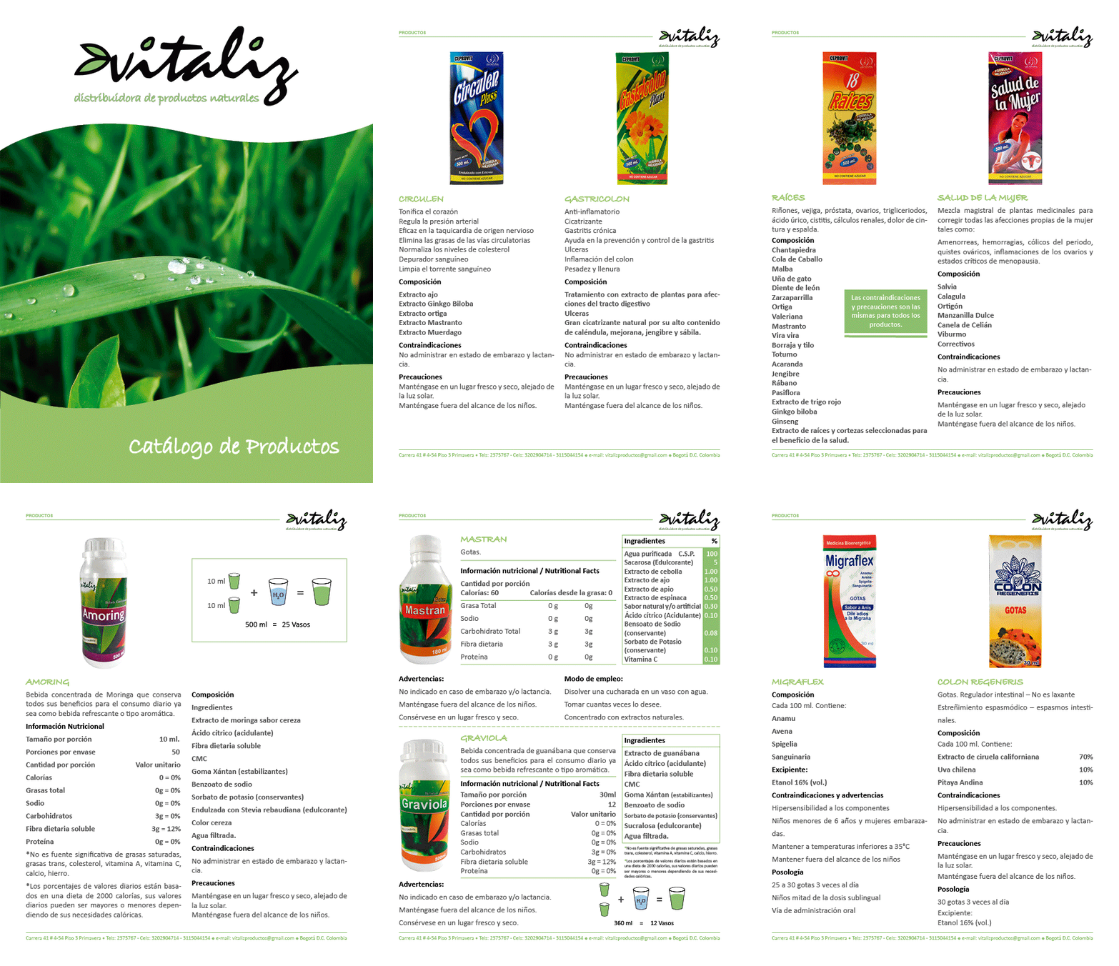
For the Catalog I performed both Photography and Graphic Design; starting for shotting a session where the proper lighting scheme was set, allowing suitable captures for each product on stock.
I implemented Adobe Photoshop and Lightroom for the background removal and retouching.
All the information was compiled and organized using InDesign, including the cover design (featuring aforementioned Aloe).
For the concretion of the whole production, I did a meticulous revision, finalizing art and remitting it to consecutive printing. I created every aspect of this compilation, making sure that all the elements followed the corporate guidelines and delivers a notable result.
The catalogue samples were shipping via mailing post to the most valuable clients and a digital version was submitted to potential new customers.

About the Logo
For Vitaliz word, the typeface was conceived thinking about organic shapes and the fundamental content of these meds, plants. So I proceeded to manipulate the name adding some leaves and combining it with the typeface characters, filling some parts with a fresh greenish color related to its natural essence.
For the Natural Products Distributor line I wanted it to follow the same path of the name but in a cleaner version that display an easy reading and keep it all simple and fresh.

bottom of page